My Process for Commercial Hand Lettering
Have you ever wanted to get into commercial client lettering, but didn’t really know how to start? It’s a daunting endeavor if you don’t “know the process” or if you’ve never done it before.
The post below is intended to give you a high-level breakdown and a bit of insight on how I went about creating, presenting and refining this lettering piece for Lightshade Cannabis Company, a Colorado-based cannabis brand.
For context, the request for this project essentially was: “to create an illustrated lettering piece of the Lightshade tagline: ‘the difference is night and day’ and to create one influencer post that showcases the work created.”
Step 1: Meet with your client and ask questions.
This process is fairly informal, but it's a great way to build trust, learn more about their business and product/services, and help align on project goals. In this instance, I was working with Lightshade through Hybrid Marketing, a local marketing shop, so I met with both teams at the same time.
The questions I ask are always project-dependent; however, for this project I wanted to understand the reasoning behind the business name, what their tagline means, their target demographic, what their unique selling proposition is, the general history of the business, how long they've been in business, and then any other quirks or interesting facts about the business that could shed light on a creative opportunity.
During our initial discovery meeting I learned that the name Lightshade comes from the split 12hrs of light and 12hrs of dark that is needed to push a cannabis plant into the flowering stage: hence the tagline, “the difference is night and day”, which is also a nod to the high quality products they offer. This play on light is at the foundation of the business name, and I felt that a play on light for this project, in some way, would be a fun exploration from both a creative and strategic perspective.
Step 2: Sketches
This is the most important part. Do this before you do any inspiration searching. Sketching is essentially a brain dump — a messy, unrefined process where you can get your ideas out on paper.
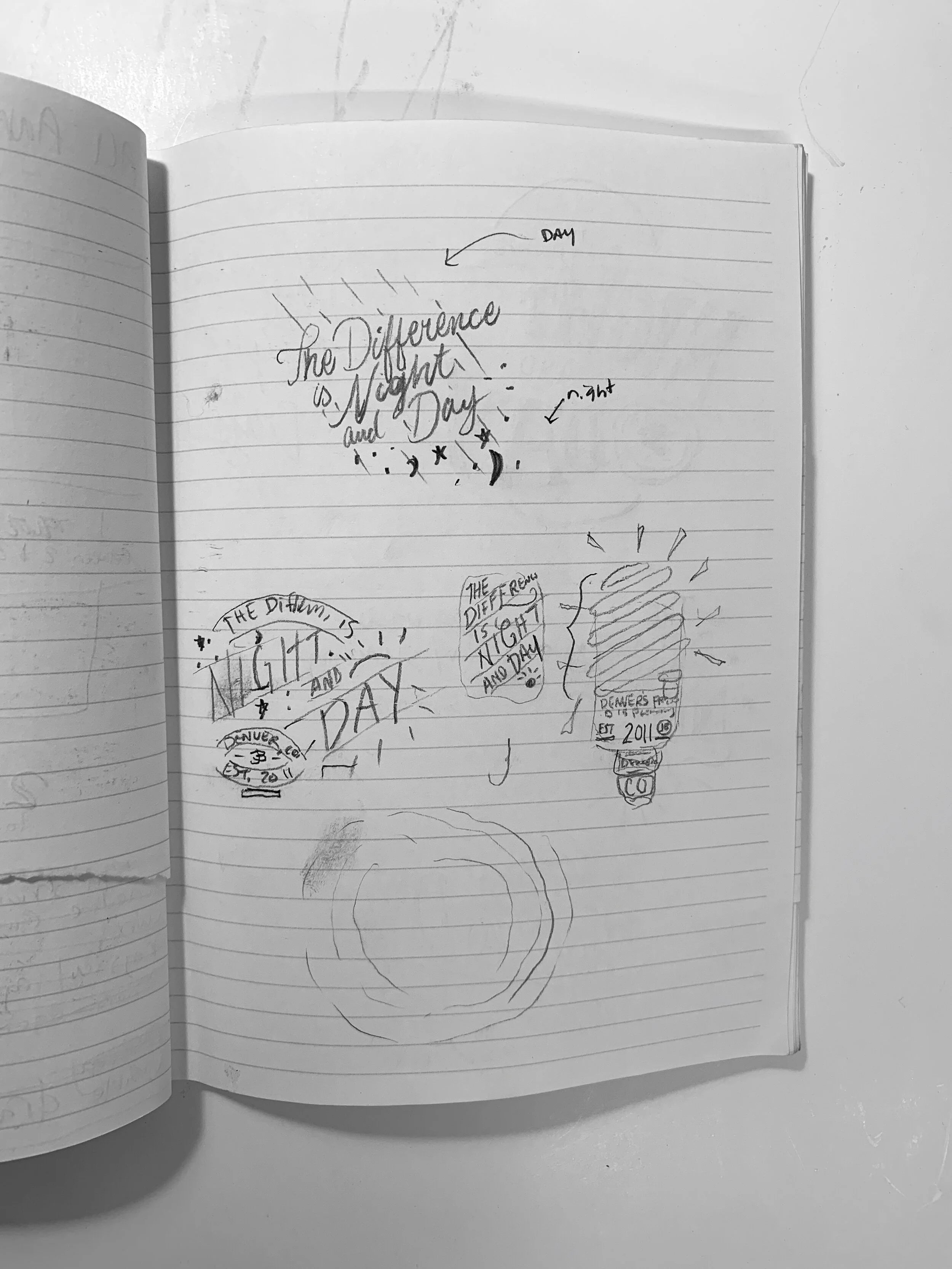
I try to explore a large range of styles in the sketching phase. I feel it's important to get anything and everything out and to be able to look at it as good or bad. While exploring numerous typographic styles and compositions, I also explored various ways to implement the idea of "light" and/or "dark" into my typography. Everything from sun rays and stars to light bulbs and the use of typography that is has light or dark connotations or feelings. Here’s a few shots of some initial sketches.
One of the most important steps in this process, for me, is to step away. Once I've done a bunch of different sketches, I need to step away as to 'cleanse my palette' and then come back to my sketches with a fresh brain and fresh eyes, and then at that time, I can make my selects.
Step 3: Refining sketches for Round 1.
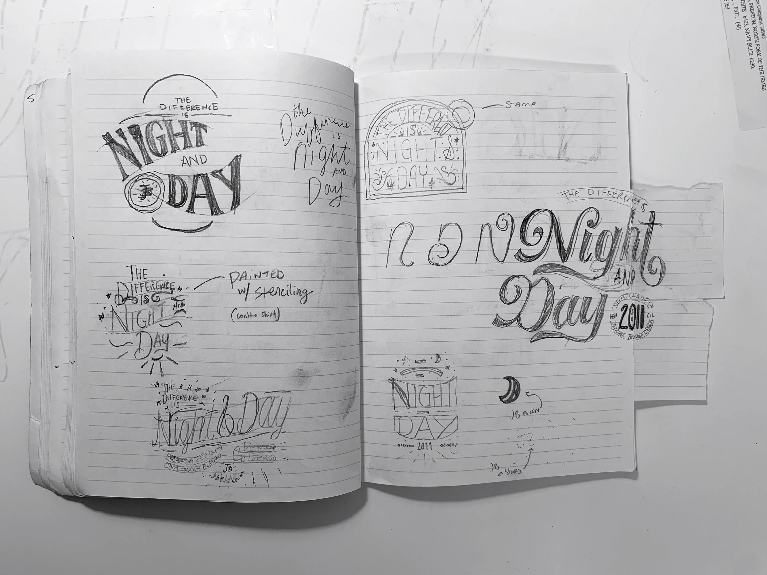
This process is literally as simple as photographing your sketches with your iPhone, and the airdropping that photo to your iPad. I then use Procreate to draw (on a new layer) directly over top of my original sketch. I will also add guidelines for my baseline, stress (angle), x-height, and cap heights.

A quick look at my initial sketch getting refined. My process for this is as follows: photograph sketch with iPhone, airdrop photo to iPad, import photo into Procreate, make two additional layers above photo: 1 for guidelines, and 1 for my refinements.
In a lettering project such as this, I like to start my R1 presentation with a diverse selection of sketches. This enables the client to more easily identify which directions feel 'right' and which don't.
I ultimately landed on these 4 sketches for the following reasons:


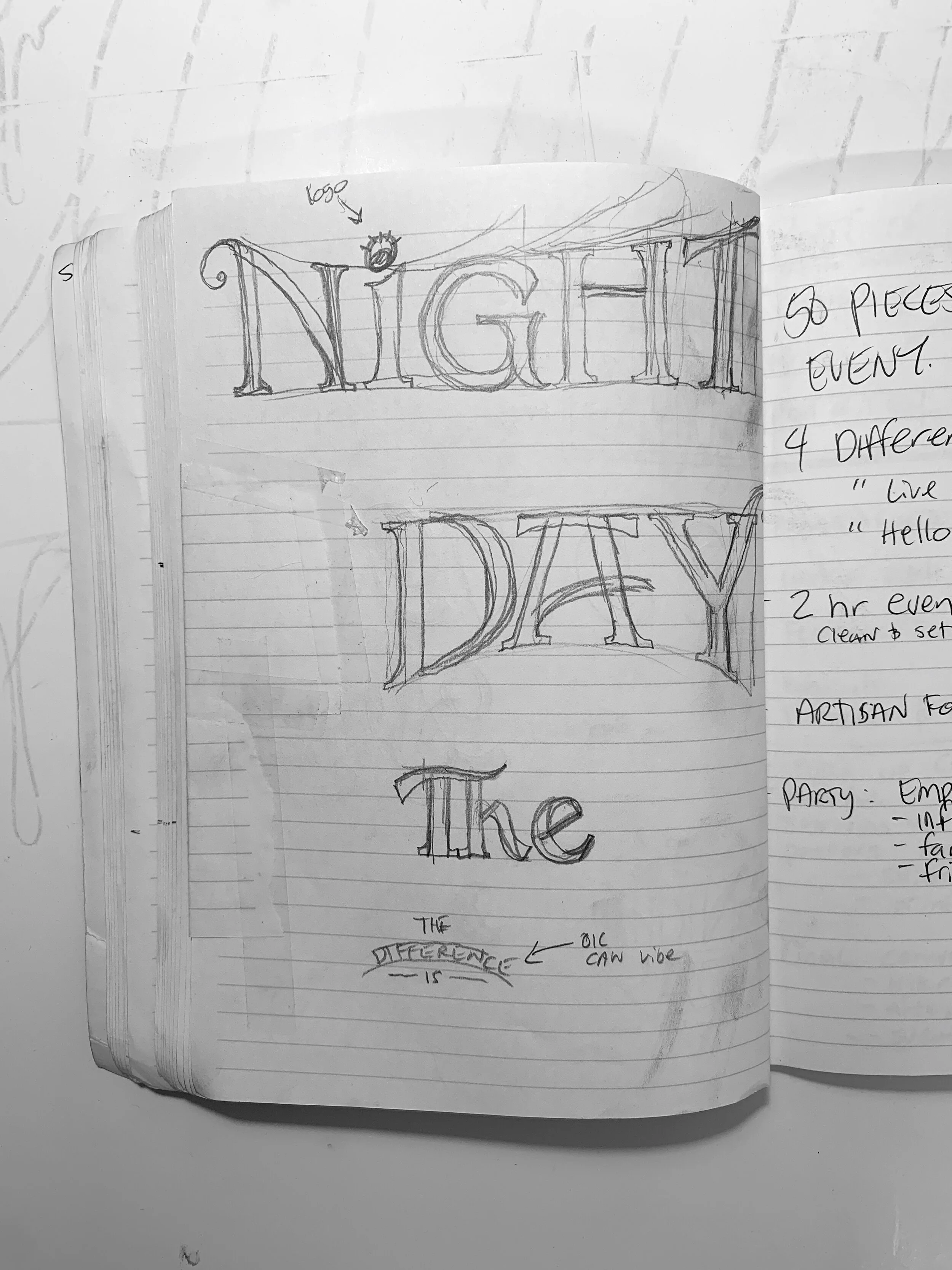
I really enjoyed the light emanating from the ampersand as well as the playful organic type that is inspired by cannabis plants. I liked this direction for its 'tweener' type that was technically sans serif, but also felt like a script.
I wanted to show one direction that really used the logo, despite that not being a request. Additionally this particular direction leveraged filled vs outlined type, which was used to convey the 'night' and 'day'. This type's soft serifs mimicked the edges of a cannabis leaf.
I wanted to present one all-script direction. This particular direction had some fun, organic visual flow, that of which was inspired by the cannabis plant.
This direction leaned more heavily into the lifestyle inspiration. Knowing this was being used to produce swag/etc, I knew that this needed to have marketability. These type-dense lockups are seen in the lifestyle and apparel industries a lot, and opposed the opportunity to tell a deep story with lots of inspiration in a visual way. Additionally, little elements were used to subtly convey light rays/cannabis leaves.
Step 4: Round 1 presentation.
In addition to talking through my concepts and thought process on each individual direction, I showed these pieces mocked up on t-shirts to help show their intended use.

Step 5: Receive client feedback.
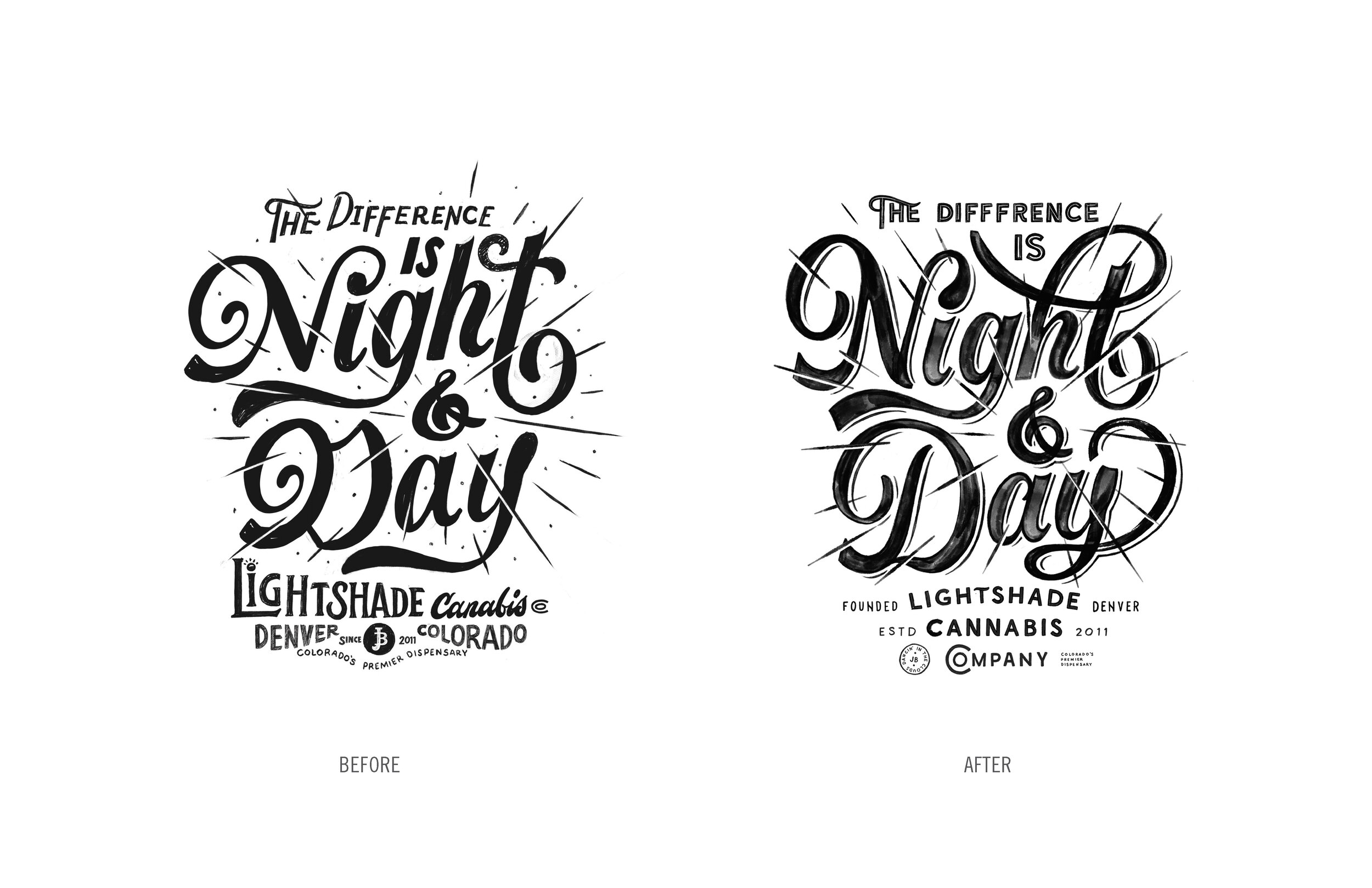
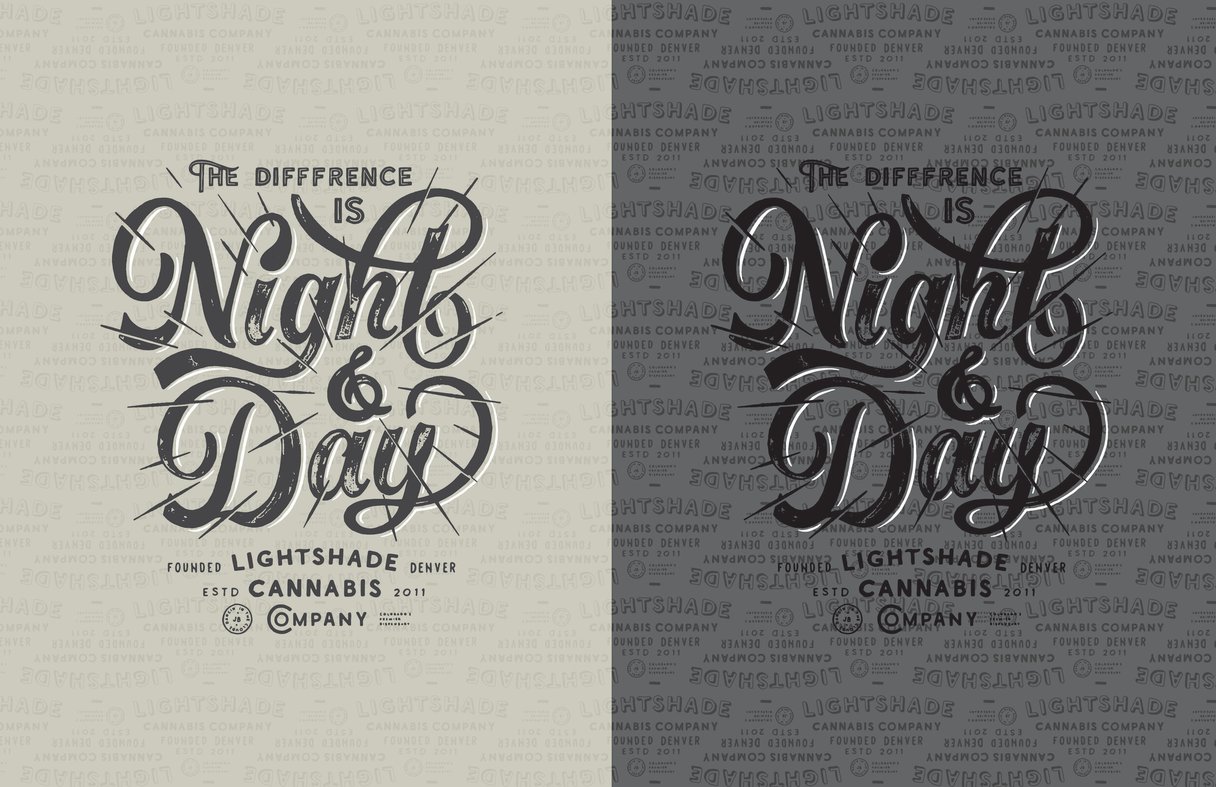
I was lucky on this project, and there wasn't a whole lot more feedback than "we want to go with direction 1. Please update the spelling of cannabis, and we feel like there's too many typefaces in this direction." (this was the first of 3 misspellings on this project ) Sonofa!
But, from here, I essentially just go back in and refine the entire drawing. See here the procreate export to show what that process looks like.
During this time, I focused on 5 main things:
Consistency in line weight and visual weight (similar thickness on down strokes, upstrokes, counters and letter widths)
Consistency in baseline/x-height/cap height (the invisible line where the letters sit, the tops of the lowercase letters, and the top of the capital letters)
Consistency in terminals (the 'ends' of the letters)
Overall compositional flow and balance
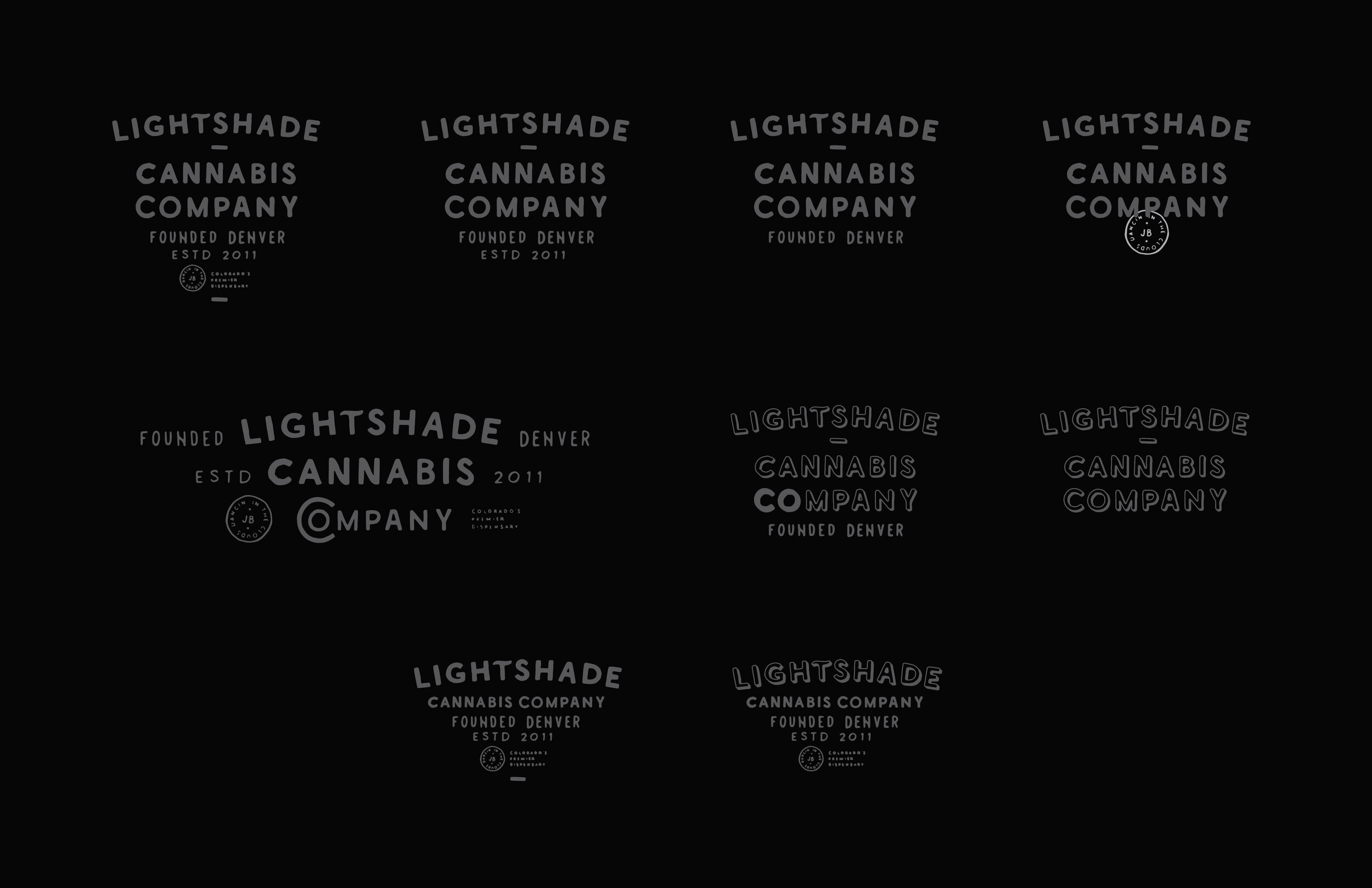
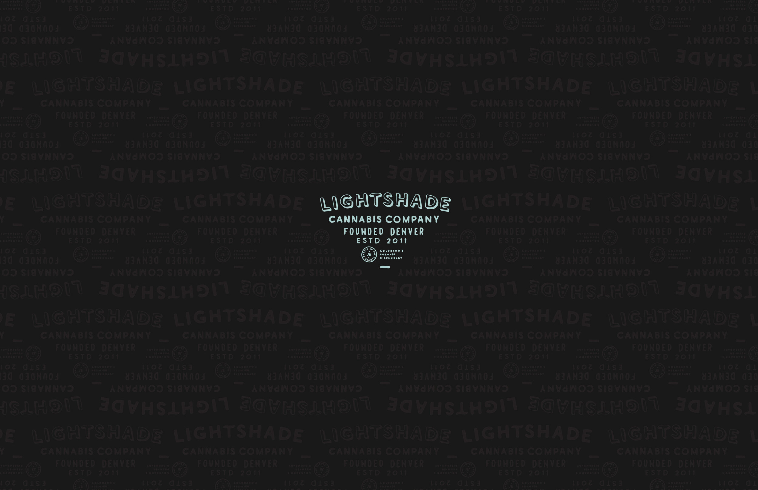
How to best simplify the footer information as to best compliment and simultaneously contrast this piece
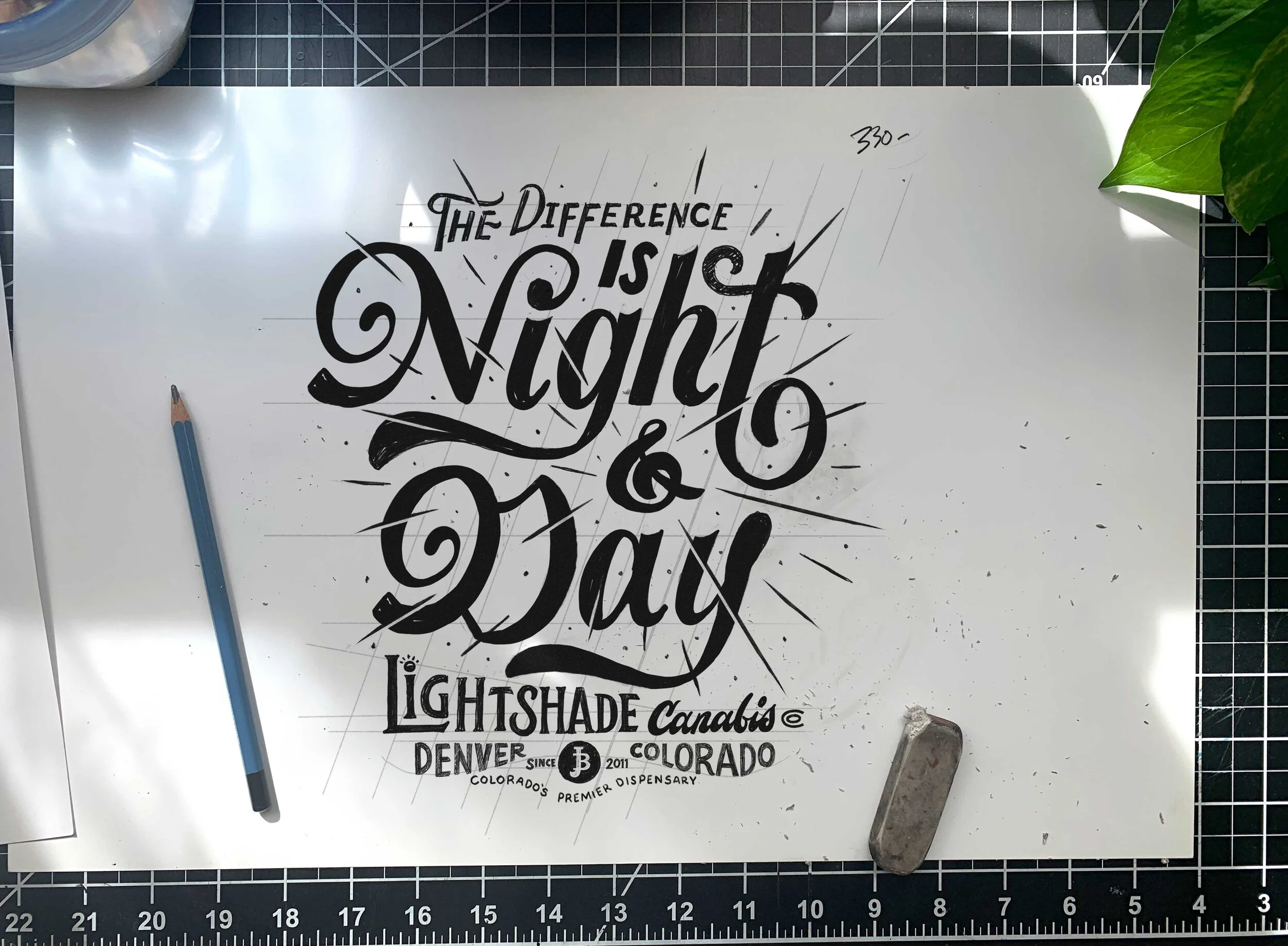
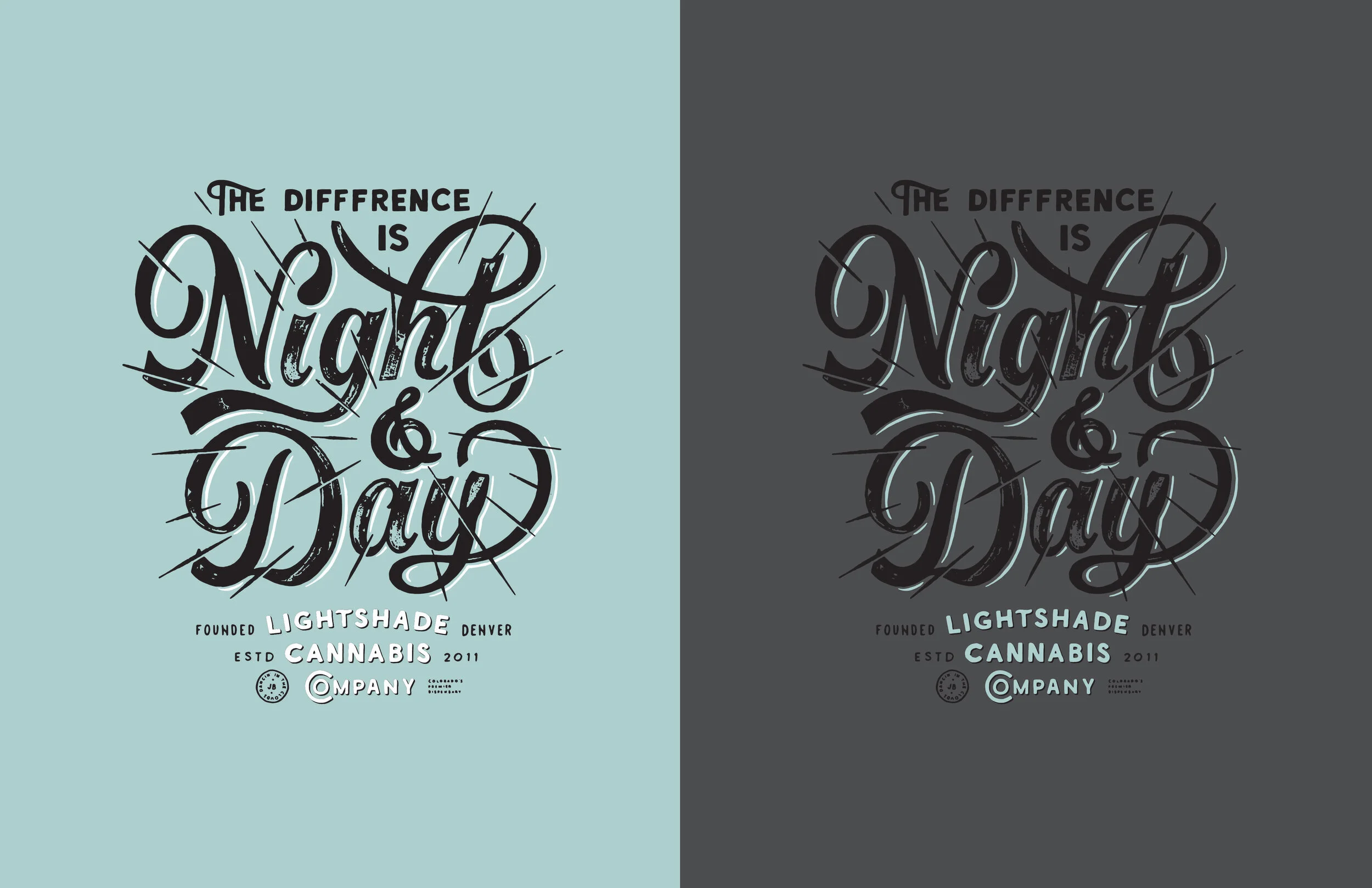
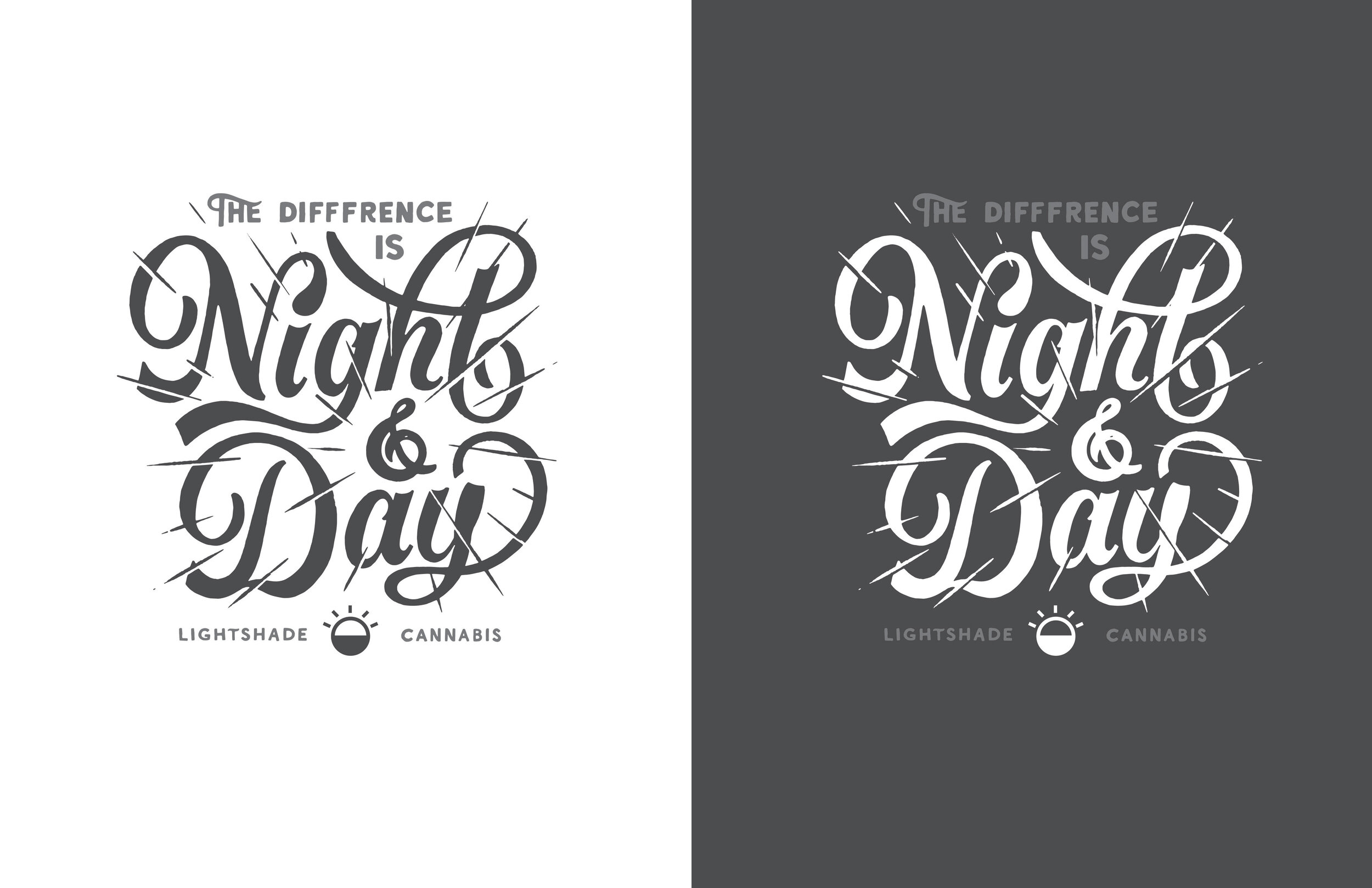
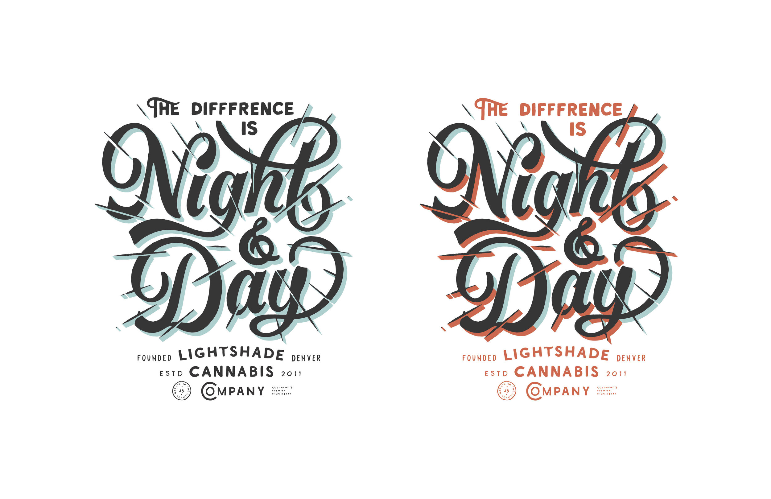
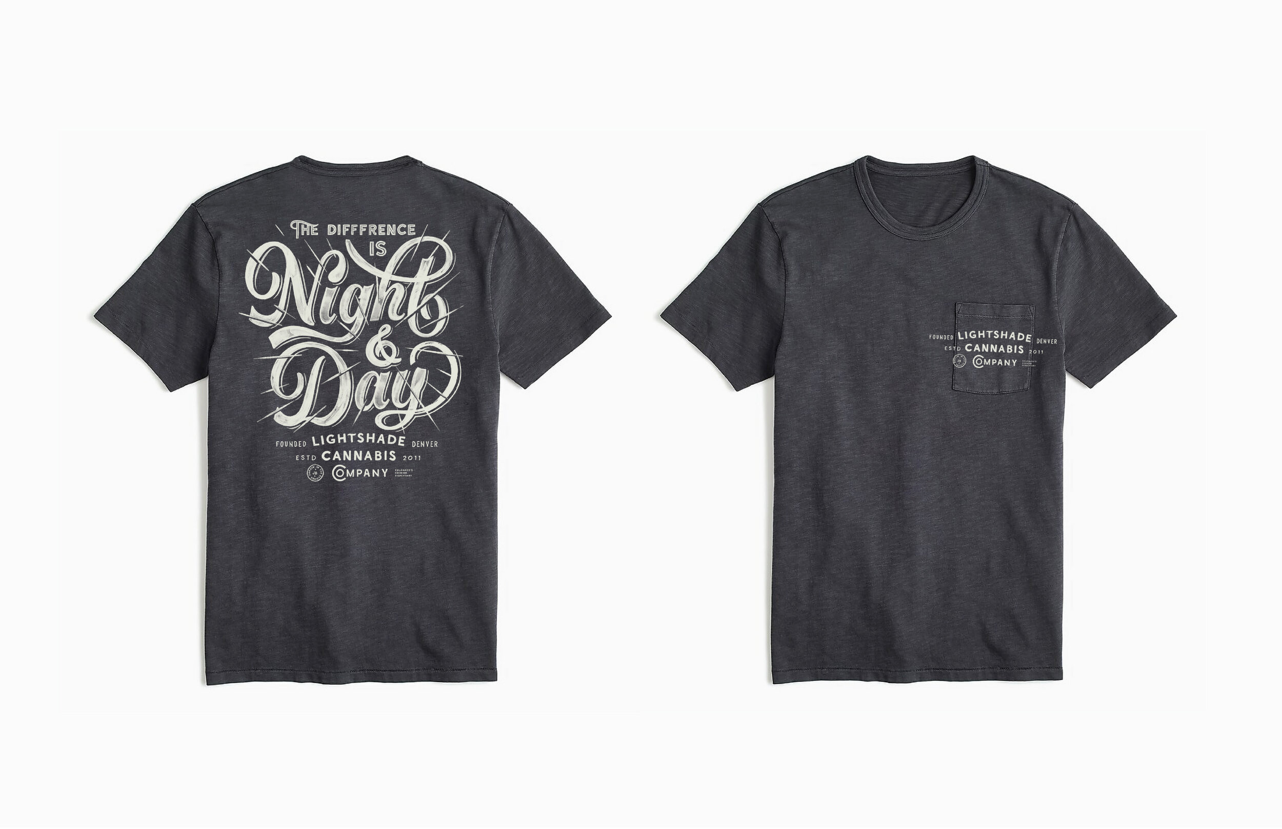
Eventually, this is where I landed. Like any and all pieces, there are absolutely places that could be readjusted, fixed, or better. However, I am one to embrace the imperfections in my work.

Mostly-final lettering
Step 6: Influencer post.
This process is a blog post in itself. So, I'll break it down simply in terms of how I approached this particular piece.
This is a drawing for a cannabis brand, so in the flat lay, I want cannabis-associated artifacts and paraphernalia as well as drawing related items.
I tend to have fairly even light or cast shadows in my work — in this particular piece I wanted to try a bit harsher shadows to try something new.
I started by setting up the elements around the perimeter of my paper in a way that was compositionally balanced and aesthetically pleasing. I made sure to consider that my sketch has a vertical orientation, so I left a vertical rectangle of negative space in the center.
I then have a buddy (in this case, the amazing Luke Gottlieb AKA Victor of Valencia on Instagram) snap a handful of pictures with various hand placements.
I then edit this photo to my liking, and bring in my lettering illustration as a smart object in photoshop. From here, I adjust the color of the illustration and the layer effects to achieve a look that feels right.
Finally, I export a jpeg and get ready to post for Instagram.

Thumbnail view in Adobe Bridge of a few of the initial shots — only true difference is hand placement.
BONUS!
My project deliverables were: vector file of 1 lettering illustration, 1 influencer post of the aforementioned lettering.
What I delivered (some seen below): Multiple iterations of lettering, a breakdown of multiple uses of the footer, examples of how to use that footer lettering in it's own way, shown application of lettering tagline, 1 influencer post, and this blog post explaining my process.
Why do this extra 'free' work?
Well, I did this for many of reasons. The main reason for this blog post was to give you insight into my process and help you understand how I work in the hopes that this helps you and your commercial lettering! But also, I want to emphasize the importance of building relationships in business. I absolutely loved working with Hybrid Marketing, the agency who hired me for this project. The gents over there were very accommodating, helpful, and thankful, and they're the type of people I want to continue to work with. So, I went above and beyond with the hopes of showing that I'm someone worth working with again. We'll see how that pans out...
If you have any more questions regarding this process, comment below or ask in the comments on the IG post below!